Bundles save up to 25%. See every bundle

Code Boss
Dark

Full screen

What it does

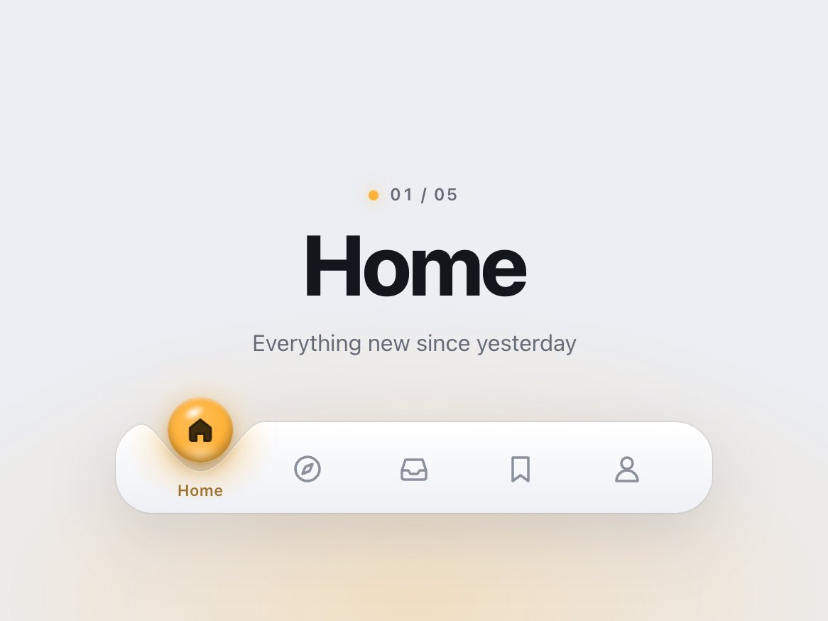
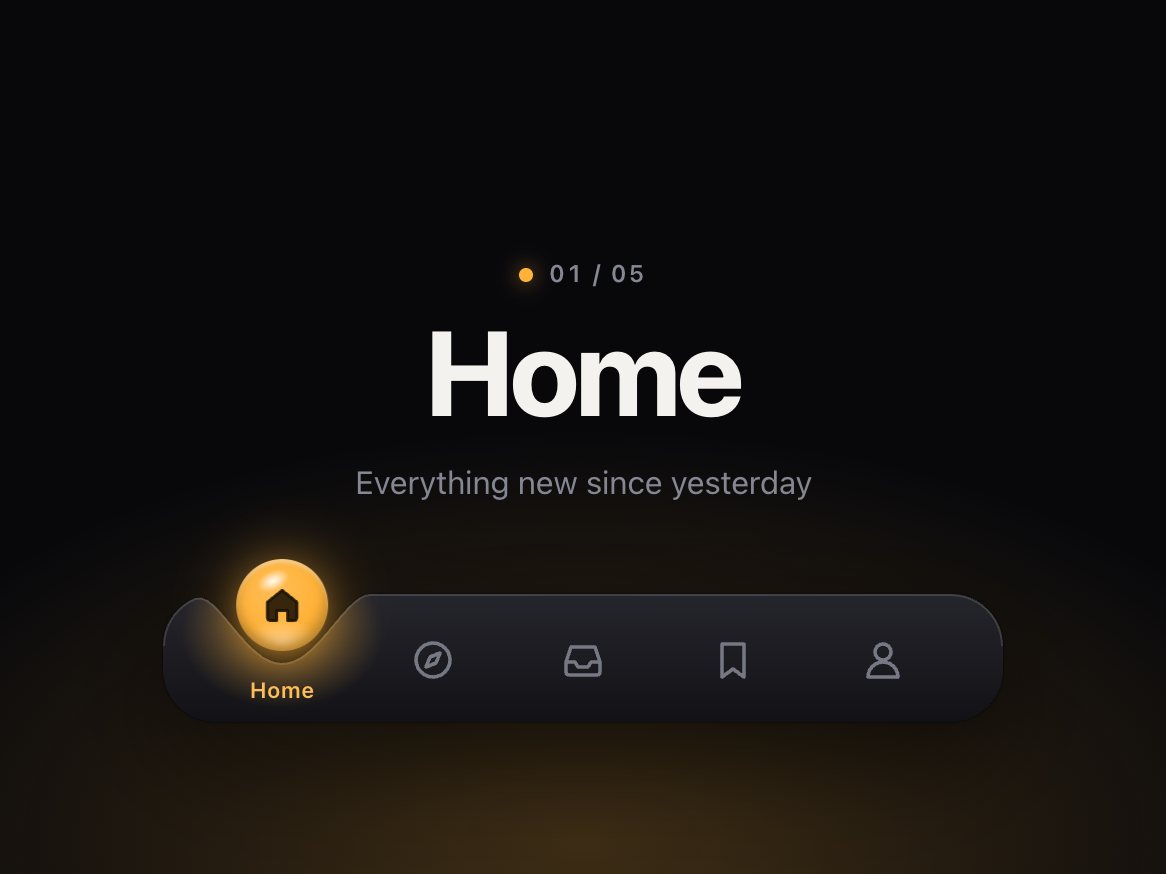
A five-tab bottom bar for app-style sites. The bar's top edge dips under the selected tab, and a glossy drop in that tab's colour floats in the dip, carrying the tab's icon. Tap another tab and the drop hops there: it stretches as it leaves, its colour blends to the new tab's on the way, and the dip follows underneath as a shallow wake that the other icons sink into. It lands with a squash, the dip sinks under its weight and wobbles back, and a ripple runs out along the bar in both directions. Tap again mid-hop and it simply changes course. You can also grab the drop and slide it along the bar: it takes on the colour and icon of each tab it passes, and when you let go it hops to the nearest one at your speed.

Good for
Mobile-first web apps, PWAs, travel, social, food and lifestyle apps, any product site that wants a tab bar with character.
How it works
A handful of springs on one requestAnimationFrame loop move the drop, the dip and the squash. Each frame the script redraws the bar's outline as an SVG path: rounded ends, the dip under the drop and any ripples still travelling. Dragging uses Pointer Events and hands the pointer's speed to the same springs on release. Works with mouse, pen and touch; vertical swipes still scroll the page. Your markup is just five buttons with icons, labels and a data-tint colour each.
How to use
Copy two files, paste the markup, call init(). It fires onChange with the tab's index and value.

Specs

Price
$12, one payment
Version
1.0.0
Code size
8.4 KB gzipped
Dependencies
None
Built with
HTML, CSS, JavaScript
Category
Navigation
Licence
Unlimited personal and client projects
In the zip
  • dimple.css dimple.jsthe component
  • index.htmla plain example page
  • README.mdsetup, CSS variables, icon guide, API, React notes
  • package.json vite.config.js npm install npm run dev
  • LICENSE.md

Use it in your project

  1. Copy dimple.css and dimple.js into your project.
  2. Add the markup from index.html (the block between the COMPONENT comments). Each tab is a button with an icon, a label and a colour; the bar's surface, the dip and the drop are drawn by the script.
  3. Start it:
import { init } from './dimple.js';

const dimple = init(document.querySelector('.dimple'), {
  onChange: (index, value) => console.log(index, value),
});

Mark the starting tab with aria-selected="true". Each tab's data-value is passed to onChange, and its data-tint is the colour of the drop while that tab is selected (any CSS colour). Leave data-tint out and the drop uses --dimple-tint.

### Your own icons

An icon is one 24 × 24 SVG with the class dimple-icon and two paths that share a shape: .dimple-fill (the solid shape, shown only inside the drop) and .dimple-line (the outline). Draw on a 24px grid with round caps. Any number of tabs works; the dip and the drop size themselves to the space each tab gets.

Questions

What exactly do I get?

The full source, an example page and a README. No account, no framework.

Can I use it in client projects?

Yes, in unlimited projects. You can't resell or share the source itself.

Do I need React?

No. The README shows how to use it in React or Next.js.

Can I change the colours and icons?

Yes. Each tab has its own data-tint colour; each icon is one SVG with an outline path and a matching fill path. Any number of tabs works.

Is it keyboard accessible?

Yes. It is a tab list: Tab to focus, arrow keys, Home and End to change, Enter and Space to select, with a visible focus ring. Keyboard changes fade the drop to the new tab instead of hopping. The drawn parts are hidden from screen readers.

Can I drag it?

Yes. Drag the drop, or drag sideways anywhere on the bar, and let go. onChange fires once, on release. Pass drag: false to turn it off.

What about reduced motion?

The drop fades between tabs instead of hopping, with no stretch, wobble or ripple. Dragging still follows the finger and settles without overshoot.

Light and dark?

Both are designed: a white porcelain bar with a soft shadow in the light theme, a graphite bar with a fine rim highlight in the dark one, and the drop's light glowing in the dip in both. With no theme set it follows the system.

Does it work on small screens?

Yes. The drop and the dip size themselves to the space each tab gets. Tested at 320px.

What if it doesn't work for me?

If it doesn't work like the demo, you get a refund within 14 days.

Still have a question? Email us. The person who made it answers.

Your cart

Your cart is empty. Browse components

Full screen